In magazines, on Pinterest, in showrooms, or in freshly delivered apartments, a trend has quietly taken hold:
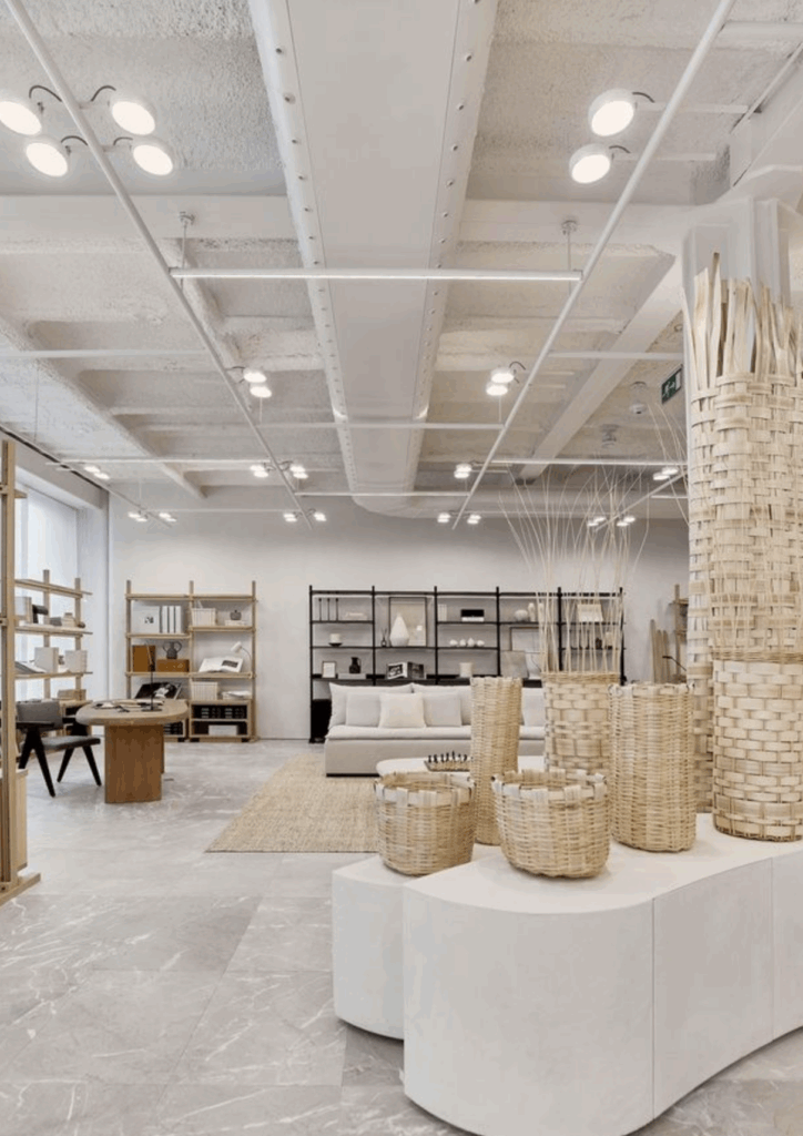
Neutral everything. Pearl grey, sandy beige, off-white. From walls to curtains, sofas to closets.
We call it timeless neutrality.
I call it the standardization of living things.
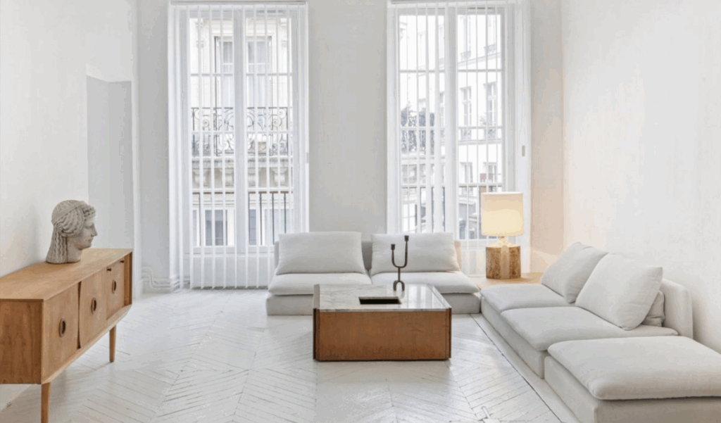
A smooth, seamless aesthetic.
Today, in a society that advocates optimization, standardization and consensus, color has become a risk: the risk of getting it wrong. To disturb. To be too assertive. Not to please.
The major chains have understood this:
Neutrality is reassuring. It sells. It can be shared.
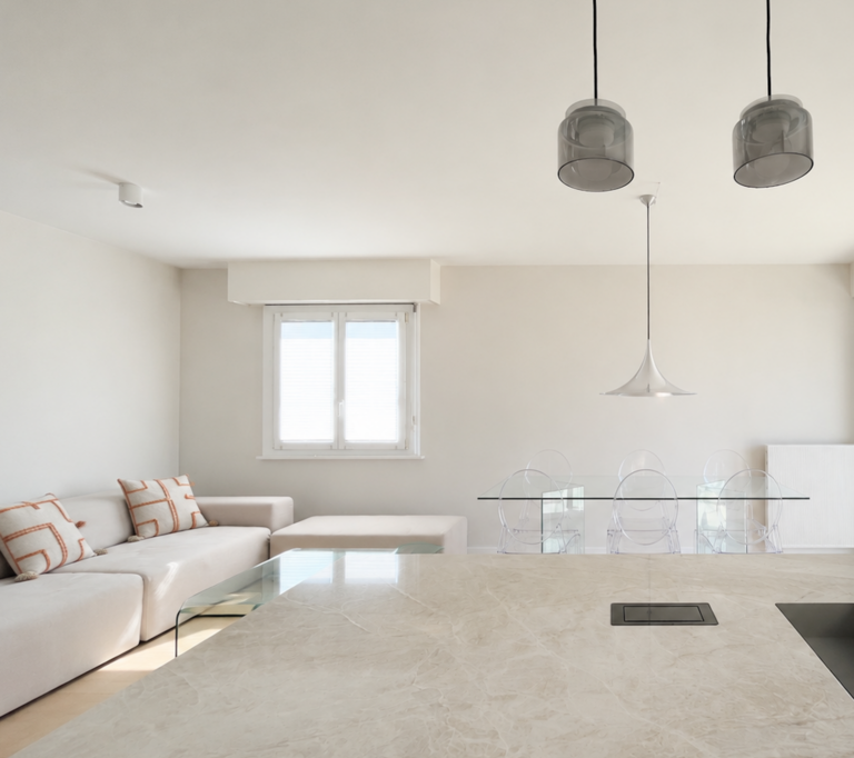
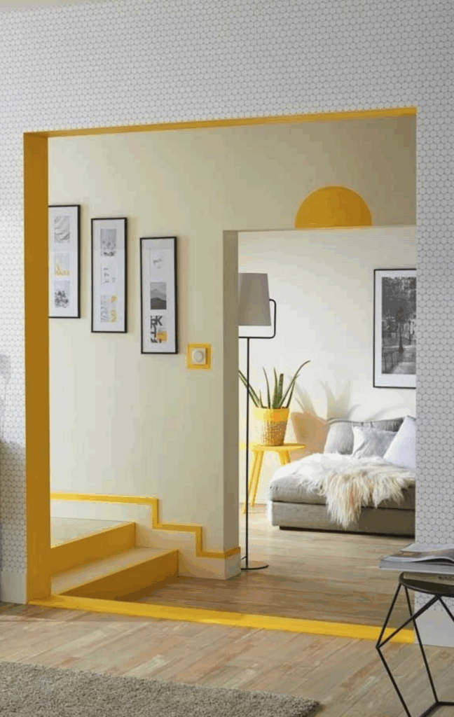
Matte beige has become the safety standard - the consensus on Instagram and in show apartments. It's the color of integrated kitchens, reception areas, building lobbies and hotel rooms that want to appeal to as many people as possible.
The result?
"Perfect" places, but with no memory, no vibrancy, no anchorage.
What color tells.
Color isn't just a decorative effect.
It's a language. An emotion. A culture.
In some parts of the world, it is part of the very identity of domestic spaces:
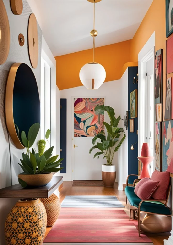
The warm tones of Latin America
The vibrant contrasts of Morocco and India
Clear blues, burnt ochres, deep greens
In my Latin culture, color is an expression of self. It speaks of warmth, bonding and shared moments. It doesn't try to look pretty. It's aboutinhabiting the world.
What you lose when you no longer dare.
The problem is not neutrality.
The problem is when it becomes the only horizon.
When everything becomes beige, you lose:
visual relief,
narrative rhythm,
and an opportunity to tell a story other than algorithmically validated good taste.
Color is frightening because it's engaging. Because not everyone likes it. But that's precisely where it becomes interesting. It forces us to take a stand. To make a choice.
And an interior is never neutral. It's an intimate projection.
Creating living interiors.
I'm not saying we should paint every room fuchsia.
I'm saying we can - and should - dare more.
At Fredricks Interior Design, I use color as a common thread.
It tells a story, highlights a light, brings out a material, evokes a mood.
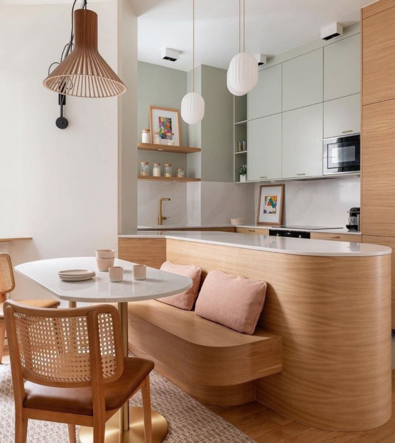
In a child's bedroom: a deep moss green to create a protective cocoon.
In a kitchen flooded with light: a grayish blue that calms and balances the light wood.
In a monochrome entrance: a saffron wall that becomes a landmark.
A customer recently said to me:
"I thought it would just be pretty, but it's changed my mood on a daily basis."
And that's the real point: color changes our relationship to space and to ourselves.
Designers who inspire me
Some architects and designers are showing that color can be bold, cultured, vibrant - without being garish or gimmicky:
India Mahdavi, for a sophisticated palette that's always just right
Adam Nathaniel Furman, for his radical and joyful visions
Luis Barragán, master of light and emotional color
Studiopepe, for their subtle work on materials and tones
All show that color is not an option.
It's a lever for interior architecture, just like light, volume and texture.
What about you?
Would you like to add a little vibrancy to your walls?
Break the all-beige mould?
Create an interior that really reflects you?
Color doesn't have to be a fear.
It can become a playground, an intention, a dialogue between you and your space.